UX Design
The key is to always design with empathy for the user as well as knowing no design is perfect. My process continues to be iterative.
Problem: Students in an online MBA program are having difficult connecting
Team members: Yi Lu, Fan Ge, & Xuan Wang
In conducting user design, we were consistently attune to which milestone we were undertaking within the traditional double diamond method of user research, design, and iteration. Assessing new ideas, collecting qualitative and quantitative data to provide insight into user actions that lead to retuning our ideas, testing our designs to further refine features to provide a workable prototype.

User Research
Who our users are:
Students participating in the iMBA program at University of Illinois most of whom are also working professionals & parents
Average age: 37 years old
Average working experience: 11 years

What platforms do they use to communicate? How many & which do they like?
Too many platforms!


Road map of our process:
-
Understanding the task at hand & job to be done: why & how are iMBA students feeling disconnected
-
Conducted eight individual user interviews, recorded via Zoom, organized data into an affinity map
-
Collected user data via survey methods
-
Re-visited design question & affinity map
-
Created personas based off of user data
-
Asked for feedback from stakeholders based on research compiled
Posed to stakeholders for further clarity:
Leaning towards building a prototype and how to implement features we know our users already like but would like feedback on whether or not we should improve an existing product
Findings:

POV STATEMENT: Professionals juggling work, school, and family want to build specific professional contacts comfortably and efficiently to achieve their career goals.
HOW MIGHT WE...?
Create opportunities for students to connect with specific professional contacts?
Create a comfortable environment for people to approach others?
Enable individuals to connect with each other when they are short on time?
Personas:


Design & Prototype
Sketching:
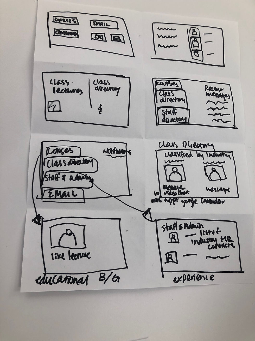
We all decided it would be best to consolidate the multiple web applications into one space, creating a competitor to Brightspace for example. While pooling our thoughts, we had two separate approaches 1. a database 2. a matching feature, which we combined into one platform, where students could easily access one another's calendars with pre-made zoom appointment slots they'd be able to schedule and see one another with.


Lo-Fi Prototype & Usability Testing:


After usability testing, we decided to remove and change specific elements given think aloud feedback from guiding our users. We changed naming conventions and the way we classified sections such as "People" to "Directory" and "Match" to "Daily Connect", we removed the "favorite" button option, and changed “tags”,“hobbies”, and “goals” to “skills”.
Hi-Fi Prototype


Heuristics & Design Rationale

